Waffle House Unveils New Logo
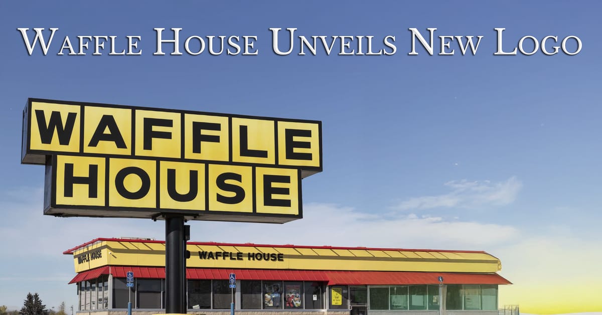
ATLANTA—Fresh off Cracker Barrel’s much-debated branding shakeup, another Southern institution has announced a rebrand that may finally align its public image with the reality inside its dining rooms. Waffle House, that fluorescent cathedral of eggs and altercations, revealed Thursday that its famous yellow block letters will be retired later this year in favor of a logo modeled directly on a 1990s WWF pay-per-view poster.
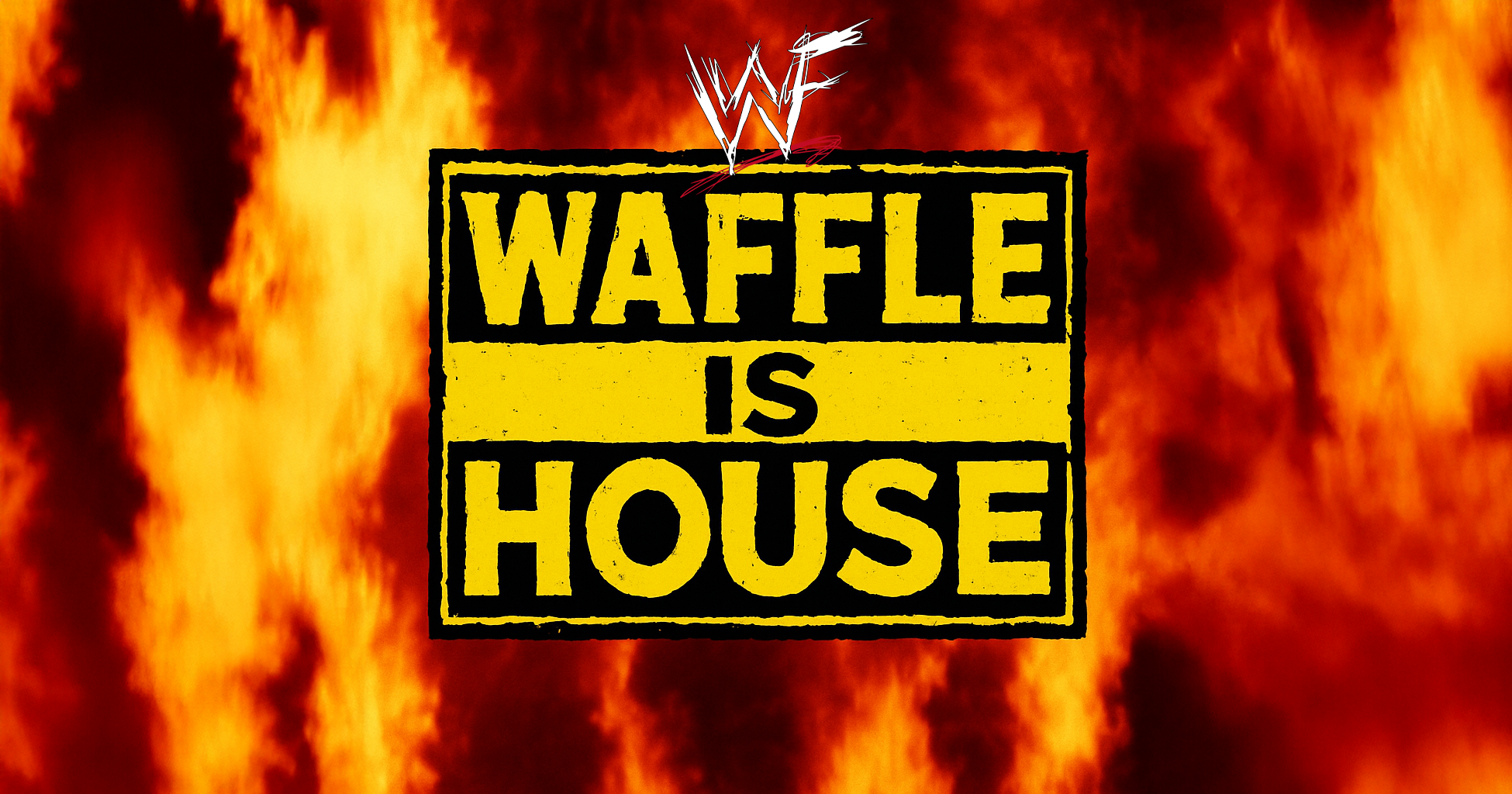
The new design—charred black rectangle, distressed yellow type, and the words WAFFLE IS HOUSE—will soon adorn the chain’s 1,900 locations. A company spokesperson confirmed the switch is intended to “better reflect both our food offerings and the fact that as a chain, we are synonymous with hand-to-hand combat.”
Industry analysts applauded the change. “Cracker Barrel went twee, nostalgic, safe. Waffle House went Hell in a Cell,” said Dr. Horace Dandridge, who studies marketing at Lipscomb University. “It’s the difference between a rocking chair and a steel chair.”
Reaction among employees was pragmatic. “Honestly, it’s safer this way,” said Brenda Whatley, who has worked the night shift at WaHo #309 outside Macon since 1997. “At least now when two drunk cousins German-suplex each other into the jukebox, I can point to the logo and say, ‘Corporate policy.’”
Customers, too, seemed relieved. One anonymous patron summed it up: “Hell, I’m just glad this ain’t woke. Or is it woke? I don’t even know what the hell is or isn’t woke no more. Either way, the hash browns were pretty good.”
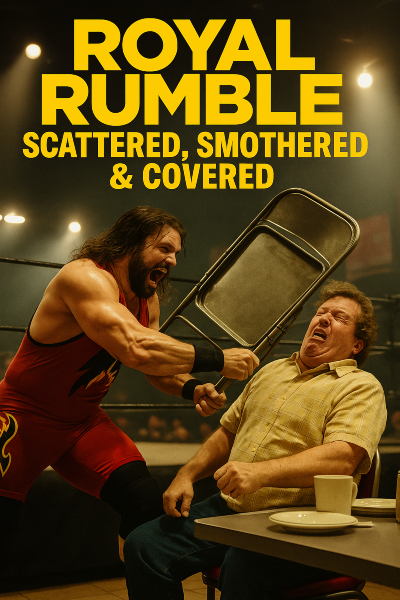
The chain confirmed that its first official in-store event, Royal Rumble Scattered, Smothered and Covered, will debut next month in Tuscaloosa, complete with ringside booths, unlimited coffee, and a referee who doubles as a fry cook.
As for the risk of violence? Executives shrugged. “If anything, this adds structure,” one said. “Now when a folding chair comes through the window, it's just a part of the dinner service.”

Comments ()